Client
Lakshmi Community
About project
Lakshmi Community is an educational initiative focused on yoga and well-being, founded by two yoga practitioners. The community organizes workshops with international specialists and produces educational content related to movement, yoga, and psychology. Before the project, Lakshmi Community did not have a dedicated digital platform for communicating upcoming events or managing registrations and payments. Information about workshops was scattered across different channels, which limited scalability and made the user journey unclear.
My task was to design a website that would centralize event communication, enable online registration and payments, and support the growth of the community while reflecting its calm and mindful character.

Scope of work

Background
The project for Lakshmi Community was set within the context of the yoga and well-being industry, where visual expression and emotional storytelling play a central role. Websites in this space are often highly aesthetic, focusing on atmosphere, harmony, and a sense of calm to communicate values such as mindfulness, balance, and inner awareness.
At the same time, many yoga websites prioritize visual appeal over usability. While visually refined, they frequently lack clear structures, intuitive navigation, and efficient registration flows. The challenge was therefore to design a website that authentically reflects the philosophy of yoga while remaining clear, accessible, and strongly user-centered.

01 Discover: What were the main challenges and how could they be addressed?
To better understand the project’s context and the needs of Lakshmi Community, I began by analyzing existing communication channels and researching websites in the yoga and well-being industry. I focused on how similar brands present their events online, structure informatio n, and guide users through registration processes, while maintaining a strong emotional and visual identity.
Thanks to this analysis, I was able to identify the key issues in the existing setup. Understanding these challenges allowed me to lay the foundation for further design stages and clearly define the main goals of the website: centralized event communication, a clear and intuitive user journey, and an efficient registration and payment flow aligned with the brand’s calm and mindful character.
Research and benchmarking
Before starting the design process, I conducted a visual and strategic analysis of websites related to yoga. This research helped me understand how similar brands communicate their values, structure content and guide users toward joining events or programs.

02 Define: What are the main problems we want to solve?
Based on the research and initial analysis, I defined the key problems that the website needed to address:
- Lack of a single, coherent platform presenting the founders, the idea behind Lakshmi Community, and the podcast content.
- No structured way to communicate upcoming workshops and events in a clear, calendar-based format.
- Absence of an integrated solution for event registration and online payments.
- No dedicated space to showcase and share photo galleries from past workshops, limiting both documentation and community engagement.
- A need for a visual language that reflects the philosophy of yoga while maintaining clarity, accessibility, and usability.
03 Ideate and prototype: How can we solve these problems?
I began by creating low-fidelity wireframes to explore different ways of structuring content and prioritizing information. These concepts were then developed into interactive high-fidelity prototypes in Figma, allowing me to iteratively refine layouts and user flows before moving forward.
After initial consultations with the client and considering technical feasibility, I defined an approach based on:
- a clear and coherent information architecture that brings together information about the founders, the idea behind Lakshmi Community, events, and podcast content,
- an event-focused structure with a calendar-based overview of upcoming workshops,
- an intuitive registration and payment flow integrated directly into the website,
- a calm, minimalist visual design that emphasizes imagery and typography while supporting readability and usability.
Based on the defined problems, I developed several initial concepts for the structure and presentation of content, informed by industry research and the philosophy of Lakshmi Community.
Sitemap

Moodboard

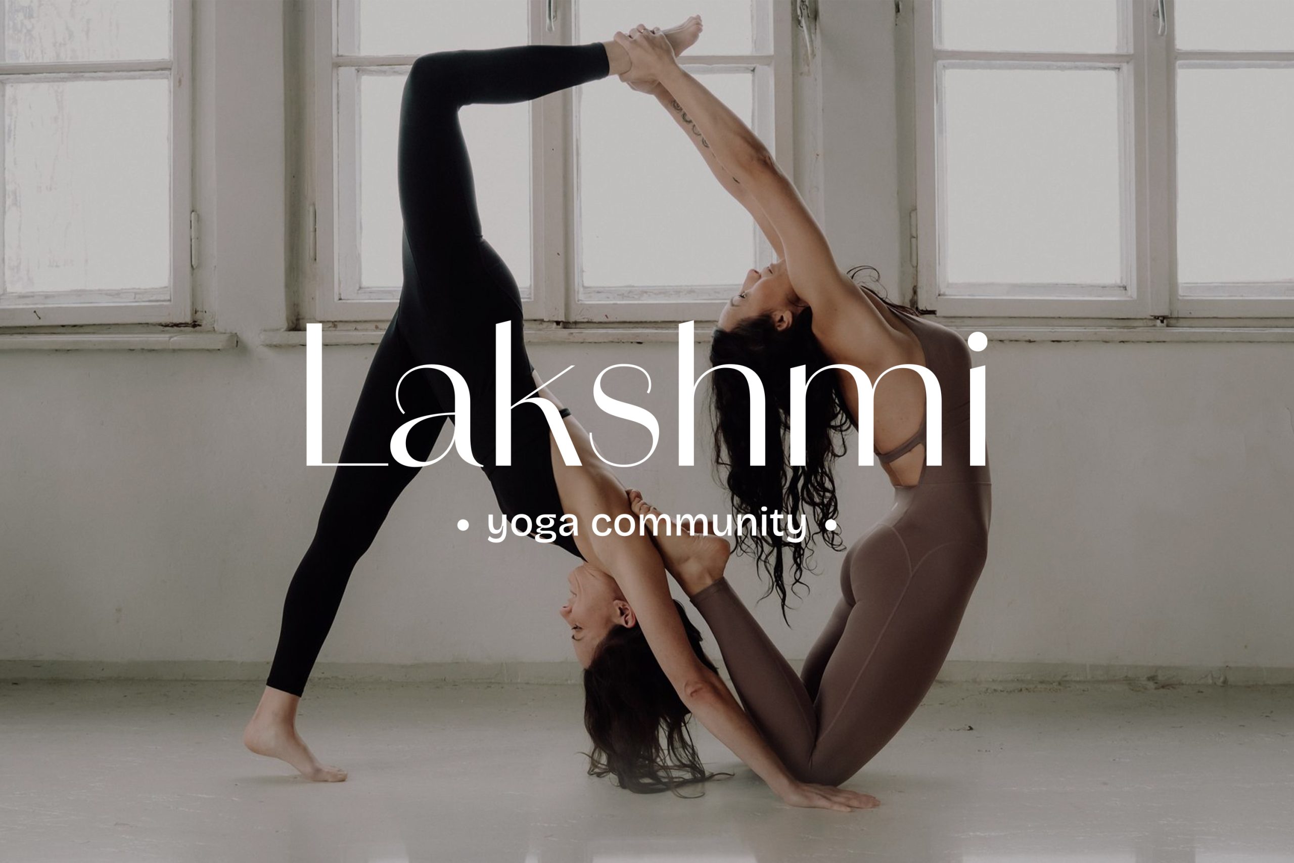
Branding
The logo was designed using the Amandine typeface. The font is carefully crafted using handwritten script and draws direct inspiration from the beauty found in calligraphy and lettering.


To create the color palette, I used classic white and black, additionally complementing it with burgundy.
The color burgundy symbolizes passion and strength in many cultures. In some contexts, especially those related to spirituality, burgundy signifies deeper understanding and introspection.
Typographic elements in photos
In the design of the Lakshmi Community website, I placed particular emphasis on the harmonious combination of typographic elements with photos.
Thanks to this, each section of the website has gained a unique character, reflecting the atmosphere of peace and balance that accompanies the practice of yoga. Subtle inscriptions gently penetrate the photographs, creating a coherent visual narrative.


Test round 1
Based on the initial low-fidelity concepts, I created an interactive prototype in Figma to validate the overall structure, content hierarchy, and key user flows. This allowed me to review the design decisions in context and assess how users would navigate between core sections such as events, registrations, and informational content.
The prototype was used as a discussion and validation tool during consultations with the client, helping to quickly confirm assumptions and align on the overall direction of the project.
Iterations, revisions and the final solution
After creating the first interactive prototype, I reviewed the design with a focus on clarity, consistency, and ease of navigation. Minor refinements were introduced based on client feedback and my own usability-oriented analysis, mainly related to content hierarchy, spacing, and visual balance.
The most important adjustments included:
- refining the structure of key sections to improve content clarity,
- adjusting layouts to better support readability and focus,
- fine-tuning typographic and visual details to maintain consistency across the website.
After these refinements, a final high-fidelity prototype was created that addressed the project goals and clearly communicated the values of Lakshmi Community, while remaining intuitive and easy to use.
High-fidelity


04 Deliver: Implementation and handoff
Based on the approved high-fidelity prototype in Figma, I prepared handoff documentation for implementation and transferred the project to a developer responsible for building the website in WordPress. The documentation included layout specifications, component behavior, and visual guidelines to support a smooth development process.
During implementation, I collaborated closely with the developer to ensure consistency between the design and the final product. As the website was built within the technical constraints of WordPress, the developer requested selected design adjustments. These changes were introduced collaboratively to balance design intent with platform limitations, while maintaining responsiveness, usability, and visual coherence.
Due to budget constraints, the team decided to use a WordPress plugin for workshop registration and payments instead of developing the custom booking and checkout flows I originally designed.
The final result is a functional and scalable website that reflects the values of Lakshmi Community, supports event communication and registration, and remains flexible for future development.